In the days before my conversation with Shepard Fairey, arguably the world’s most influential living street artist, I ran a small experiment. I told as many friends as possible that I’d be talking with Fairey, and all but one of them said, “Who?” Once I told them that Fairey created the iconic Barack Obama “Hope” poster, they all exclaimed in recognition, “Oh!”
Although Fairey has unquestionably molded global culture, he can walk down the street unrecognized. He’s more than happy to hide in plain sight: “I want my work to be the thing that represents me more than my appearance,” he explains. “That’s much more important than people knowing my name or what I look like.”
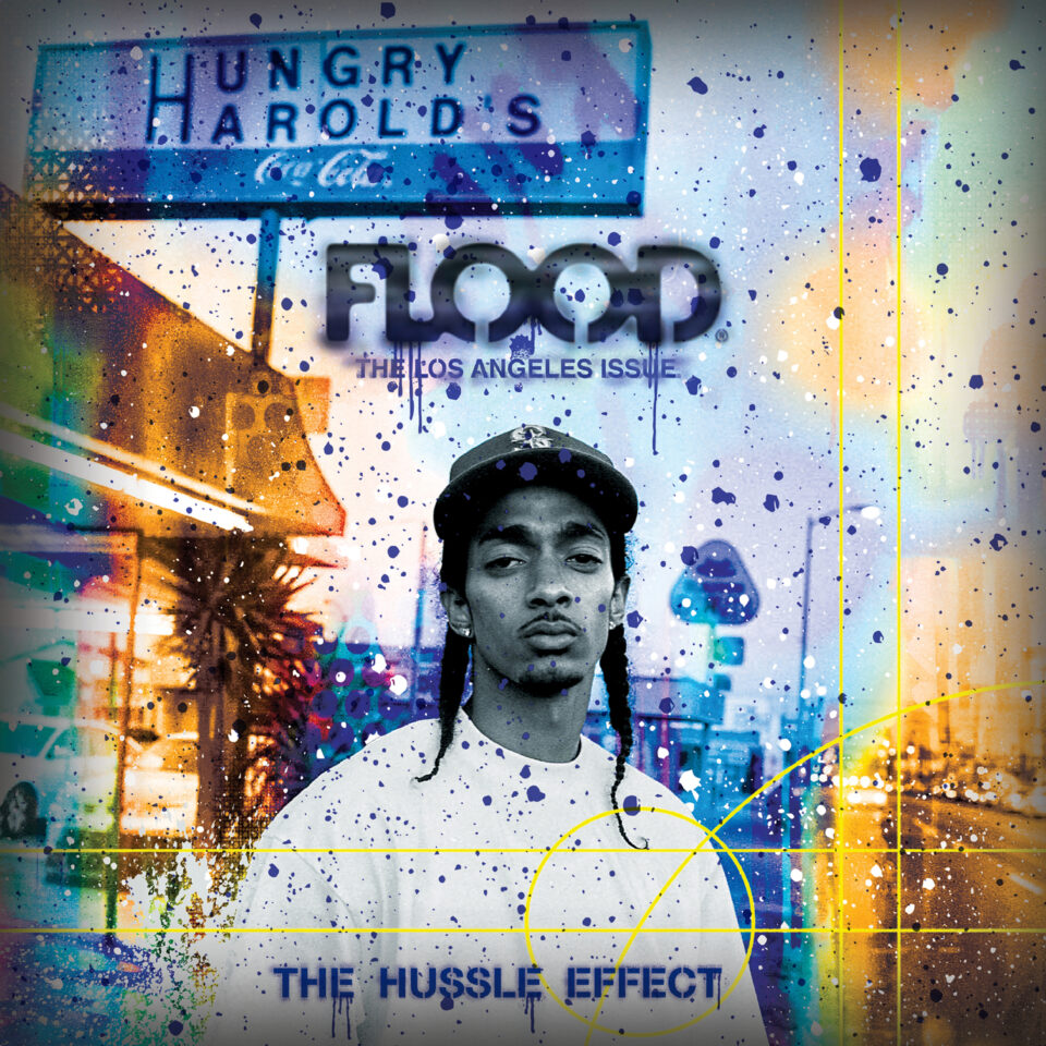
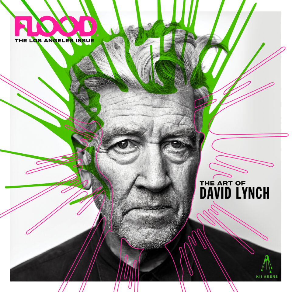
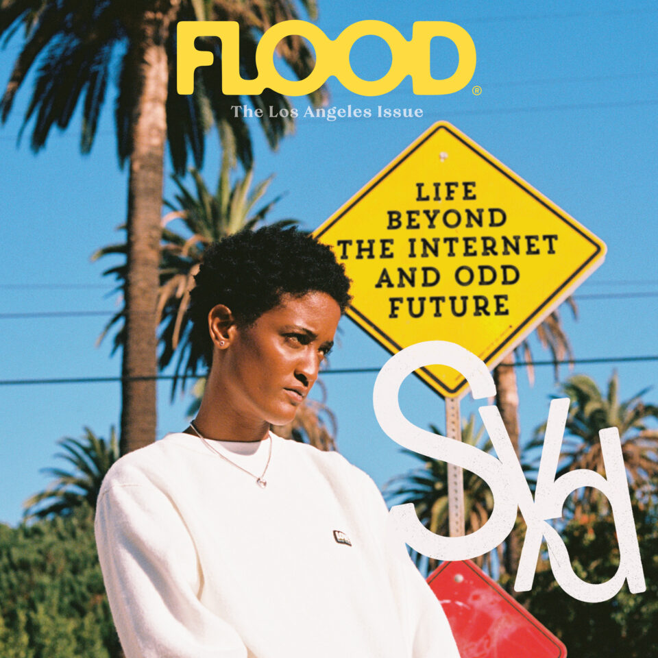
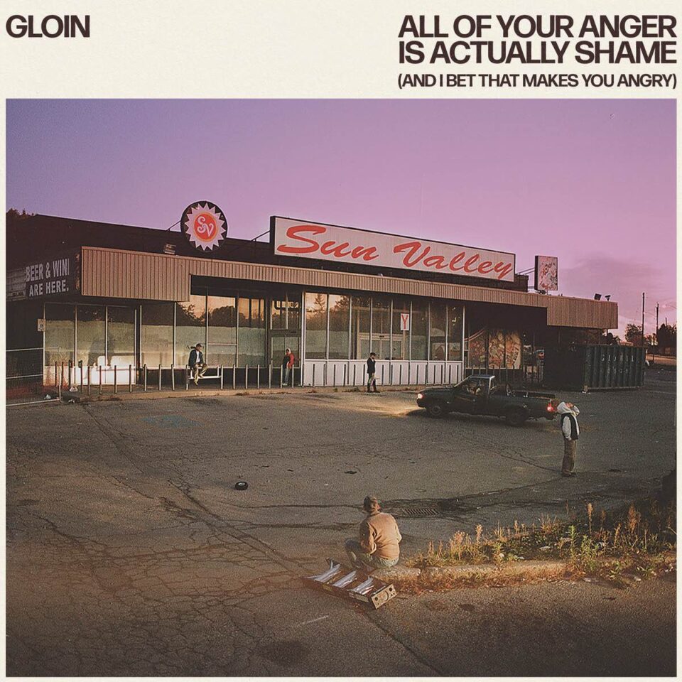
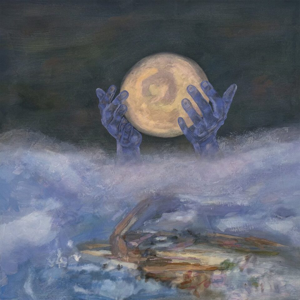
Those who do know Fairey, though, can easily identify his art, even when its usual overt politics are pared back for use on prominent album covers. Throughout his thirty-year career, Fairey has consistently blurred the lines among street art, fine art, and portraiture, with certain color motifs uniting his images of prominent global figures, everyday people, and objects associated with governmental deceit. Fairey aptly describes his style as “pop art with a bit of punk antagonism mixed in,” a combination perfectly suited to his leftist politics.
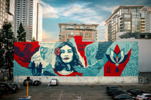
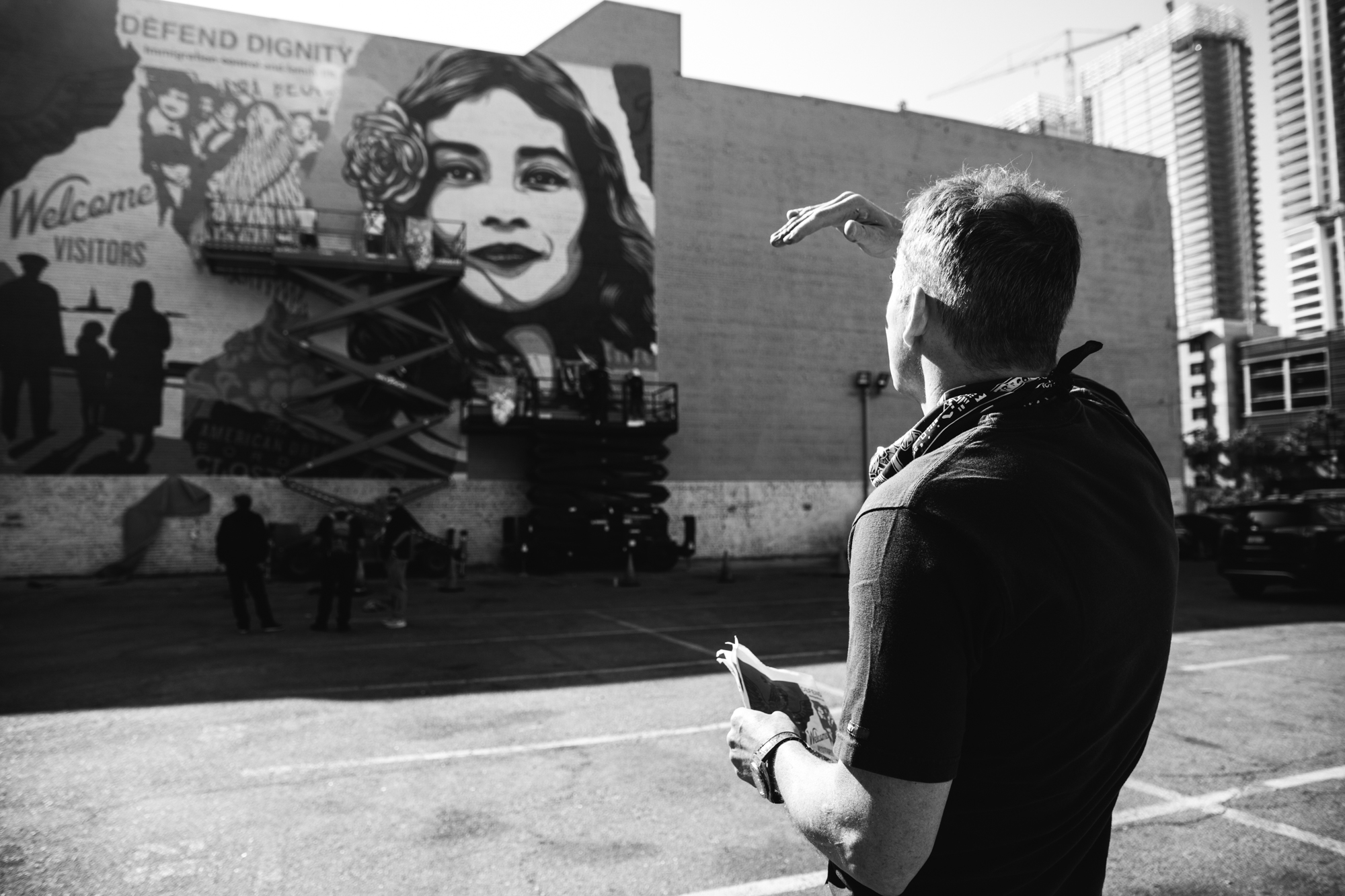
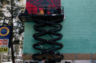
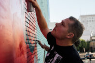
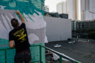
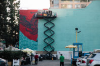
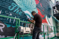
Case in point: Fairey’s acclaimed Defend Dignity piece, which he’s reviving as a 5,760-square-foot mural in downtown Los Angeles. Defend Dignity first emerged in Fairey’s traditional portrait style as part of his We the People poster series seen at countless Trump-era protests. In its modified mural form, the original portrait remains central, but the periphery is decorated with collaged agitprop—including a smirking, menacing businessman outsourcing jobs and blaming immigrants. The mural’s peripheral propaganda is both secondary to the central portrait’s beauty and undeniably overwhelming.
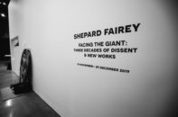
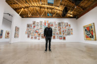
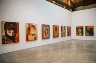
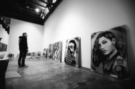
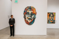
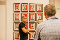
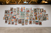
Not far from the mural, a newly-launched exhibit titled Facing the Giant: 3 Decades of Dissent & New Works is celebrating thirty years of Fairey’s work, with one hundred pieces on display. The exhibit, which showcases both well-known and brand-new works, provides a detailed retrospective of Fairey’s career and suggests that his next decade will be just as prolific—even if his work never makes him a household name. “I’m just happy that a lot of people know my imagery,” he says—and if this exhibit is any indication, Fairey will only have more art to offer in the years to come.
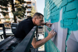
Of all your works, why did you choose to paint Defend Dignity as a mural in DTLA?
From the time I created that image for the first Women’s March and the We the People campaign, I felt like it was especially relevant. LA is great because of diversity and immigrants. I wanted to do a mural of that image when the opportunity presented itself.
The amazing thing about that location: the building is owned by an Iranian immigrant family that lost everything when the revolution in Iran happened. They immigrated to the U.S., started over from scratch, and built up a successful textile business. They’re one of the city’s biggest eco-friendly textile companies. The immigrant and environmental responsibility angles are a perfect tie-in for my work. I was super happy that the [owners] related to my work so beautifully. Rarely do you get things that are quite so harmonious.
Can you talk in-depth about two or three pieces on display at Facing the Giant?
There’s the Delicate Balance piece, which is the mandala balanced on top of the Eiffel Tower. Part of the money from that goes to 350.org and all their work to reverse climate change. There’s a brand new piece about climate change called Raise the Level that will also have proceeds going to 350.org.
“This show is distinctive from the other shows I’m doing around the thirty-year anniversary in that this addresses the thirty-year mark, but it also has new work. It isn’t a quick victory lap before retirement. I’m making new work all the time.”
There’s one from a few years ago called End Corruption. It’s saying that legal bribery isn’t a dream; it’s the American system, especially after Citizens United. Money from that goes to RepresentUs. They’re a really great campaign finance reform organization that’s put a lot of initiatives on ballots across the country, sometimes only to have a Republican legislature just overturn the will of the people and say, “That ballot initiative is null and void,” which is absolutely insane.
This show is distinctive from the other seven shows I’m doing around the thirty-year anniversary in that this addresses the thirty-year mark, but it also has new work. It isn’t a quick victory lap before retirement. I’m making new work all the time.
Now that you’re three decades in, how do you feel about some of your earlier works?
I look back at some of the early stuff, and I cringe a bit at how crude something like the Andre the Giant Has a Posse sticker is, but I also love that my spontaneity and my lack of pretense meant that I made something that had this quirky, DIY charm. I was just going with my instincts, and a lot of it served me well. I was learning in public. I’ve intentionally included a lot of the things early on that might not be my most sophisticated or visually dazzling pieces, but were important to my evolution.
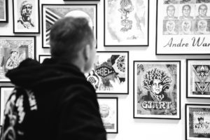
You’re best known for the Barack Obama “Hope” poster, which you unveiled roughly twenty years into your career. Ten years later, a lot of your pieces are darker in tone and they’re not solely portraits. How intentional is choosing the three-decade mark rather than the two-decade mark for Facing the Giant, given how optimistic things were in 2009 as compared to now?
Doing the thirtieth was a way for me to remind an older audience what it’s all been about and, in a very digestible way, introduce a younger audience that might be just discovering my work and get them up to speed.
There are certain repetitive motifs, colors, and iconographies that have been there intentionally to connect the dots. For the last three years, I’ve been using shades of blue in my work. Initially, it was all red, black, gold, and cream—and then with “Hope,” I used red, white, and blue on my terms. [There was still a] connection to patriotic American colors, and then I started bringing the gold into those blues. The Obama colorway, which is also the Defend Dignity colorway, is talking about American themes. The red, black, gold, and cream feels very much like propaganda.
The cool thing about meshing the two is that the tone is a little bit more neutral. It’s functioning as a Trojan Horse to get something more antagonistic through in a friendlier color palette. A lot of the new works have been going that way, but there’s still a connection to my history that’s easy to see.
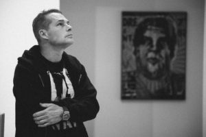
What do you credit with your gradual shift in focus from individual, recognizable people to works that don’t portray well-known figures?
I love portraiture, and I went through my list of heroes and villains in my first couple of decades. Sometimes, I’m celebrating people, but usually not the typical people, and then other times, I’m making something that presents someone in a way that’s visually compelling but cautionary.
“What I’ve found is, with a lot of the portraits that aren’t famous figures, people from all sorts of different backgrounds are projecting onto them.”
With a lot of the work that I’m doing, I’m using archetypes. For example, the We the People series were archetypes that represented the groups Trump was attacking. What I’ve found is, with a lot of the portraits that aren’t famous figures, people from all sorts of different backgrounds are projecting onto them. The fascinating thing is to hear a Native American person [look at my art and] say, “That’s a Native person.” It’s not that all my images are about race, but I love how it generates an interesting conversation with the audience. I find that when people form their own conclusions after mulling something over, they own it. It’s so much more meaningful than when they’re told how to think. FL
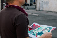
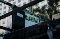
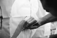
For more pics of the Los Angeles mural creation and Fairey’s Facing the Giant: 3 Decades of Dissent & New Works exhibition opening, check out the gallery below.
- photo by Jon Furlong
- photo by Jon Furlong
- photo by Jon Furlong
- photo by Jon Furlong
- photo by Jon Furlong
- photo by Jon Furlong
- photo by Jon Furlong
- photo by Jon Furlong
- photo by Jon Furlong
- photo by Jon Furlong
- photo by Jon Furlong
- photo by Jon Furlong
- photo by Jon Furlong
- photo by Jon Furlong
- photo by Jon Furlong
- photo by Jon Furlong

