Luke Healy’s first full-length graphic novel blends three stories—two based on real historical episodes from the early twentieth century, and one fictional story set in the present day—of lives that have been colored by the aurora borealis. And although the material may be bleak enough, this is not a book of grays. Instead, each story takes on a different tone, and as the stories connect, the pages fill up with a pulsating blend of greens, pinks, and yellows. Desolation has never looked better. We talked with Healy about the respective journeys of Robert Bartlett (explorer and ship captain), Ada Blackjack (a castaway from one of Bartlett’s expeditions), and the fictional professor Sully; and Nobrow was kind enough to share a few exclusive pages of Healy’s book with us, too.
 How to Survive in the North feels so personal, yet the people on display are quite varied. Is there a character here that you most identify with?
All of the characters certainly jibe with different parts of my personality. I found that interesting, as large sections of this book are a sort of nonfiction, and I wasn’t so much “writing” the characters’ actions and decisions as I was reinterpreting them from historical sources. But actually, I had originally intended for Ada Blackjack to be the center of the book. I came across her story by accident when I was looking up a photo reference for Inuit clothing for another comic. The photo from her Wikipedia page was one of the results.
It’s a pretty striking image. I clicked through and read about her life, which was fascinating. It wasn’t until years later that I decided I’d like to adapt her story into a comic. [And] it was only then that I discovered, by total coincidence, that her diary—along with many other primary sources of information about her expedition—were accessible to the public in a library five minutes away from my school.
Her story is the most personal for me, I think. But sort of embarrassingly, I also identify pretty strongly with one of the people she accompanies on the expedition, Lorne Knight. He reminds me of a younger version of myself—kind of angry and desperate for control. I hope I’ve grown out of that a little, but I definitely feel like we’re flawed in similar ways.
I would love to know which artworks (whether literary, filmic, or other) inspired this book.
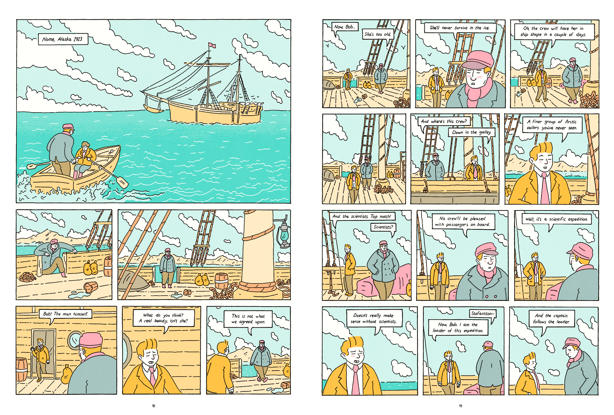
The visuals of the book were heavily inspired by the kids’ adventure comics Tintin and Little Orphan Annie. It was fun to adapt my drawing style into that mode. In terms of the structure of the book, I referenced the books Cloud Atlas by David Mitchell and The Hours by Michael Cunningham pretty heavily—and the film version of Cloud Atlas, which is flawed in many ways but is a really interesting adaptation that plays with an alternate structure to the book. I looked at that a bunch.
One thing that I’ve noticed over the years is that the staging in my comics is actually highly influenced by TV sitcoms. All of the characters sort of stand in front of these flat backdrops and cheat out to the reader. It’s sort of silly, as there’s no need to [draw] comics panels like that, but I like the effect. It gives the work a sort of staged quality.
 Right, your blend of fiction and nonfiction seems both experimental and of-the-moment, given the recent popularity of things like O.J.: Made in America and Serial. Graphic novels already occupy a strange sort of place when it comes to “truth,” but do you have a kind of philosophy with regard to honesty and the graphic novel, or how do you grapple with that fictional/nonfictional divide?
I was fascinated by nonfiction novels when I was studying to be a journalist, and that line between fiction and nonfiction has been an interest of mine ever since. I first introduced the fictional strand into How to Survive as a more functional element. In a book that is essentially about power dynamics, I hoped that including a fictional story would remind people of the less conspicuous power relationship on display in the book: the one between me and my characters.
Though all of the events depicted in the two nonfiction threads are true in a literal sense if you reduce them down to simple sentences (“Ada went to the island in 1921” etc.), the specifics on display here are as much my invention as any fictional strand. I wanted to remind readers of that fact.
Ultimately, I feel as though readers need to decide for themselves what “nonfiction” means in any medium. But I do think that comics are a particularly tricky medium in which to render nonfiction stories. By adding illustration to the retelling, the artist is necessarily commenting on the events and literally framing them through their own perspective.
 One of the bolder choices of your book, I think, is your decision to relate basically forgotten historical episodes. Is that just a function of being drawn to the stories you’re drawn to, or do you think there’s a particular benefit to telling unknown stories (or, alternatively, a peril to adapting known ones)?
I can’t really see the point in readapting something that’s already widely known. I also enjoyed exploring a mostly forgotten series of expeditions—forgotten, at least, by the larger public consciousness. When these expeditions were in progress, and for years after, they were huge national news in the United States. So in this case, there was a good balance between the obscurity of the stories, and the wealth of good sources to pull from.
 The colors of the Northern Lights seem to inform this book in a way that is more than simply aesthetic. How did you think of color as it relates to plot or themes here?
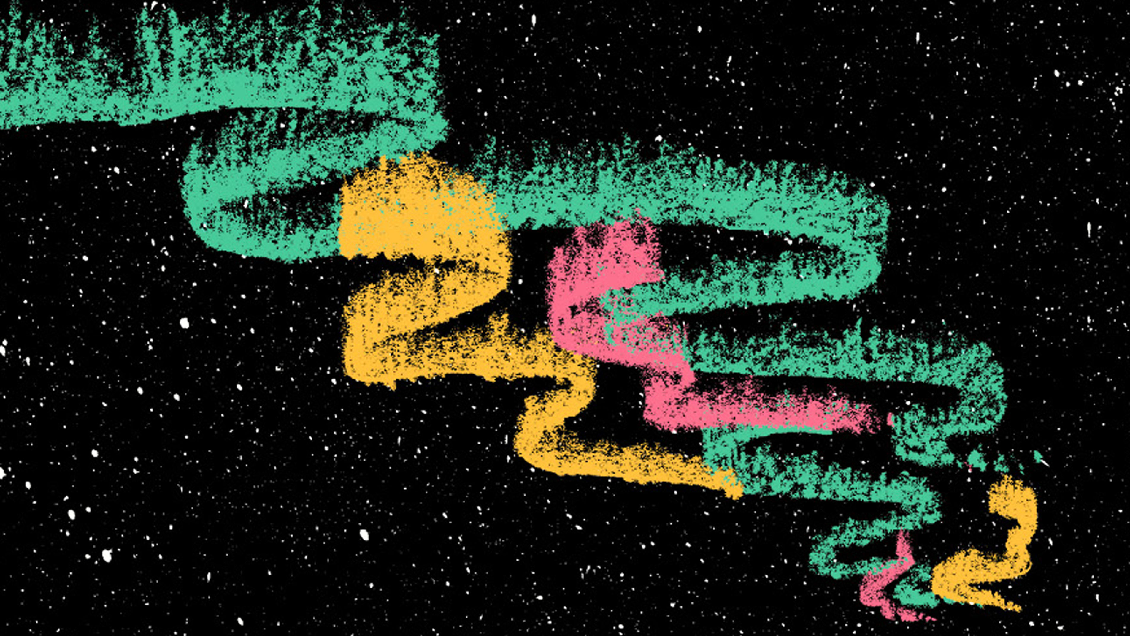
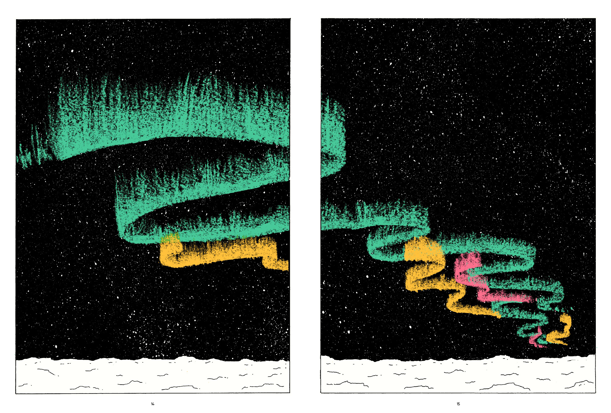
An image of the Lights themselves only appears once in the book, right at the very beginning. The inclusion of the Northern Lights is just supposed to serve as a simple visual metaphor: three different colors of light, three threads coming together to form one natural phenomenon, as the three stories come together in the book to form one narrative.
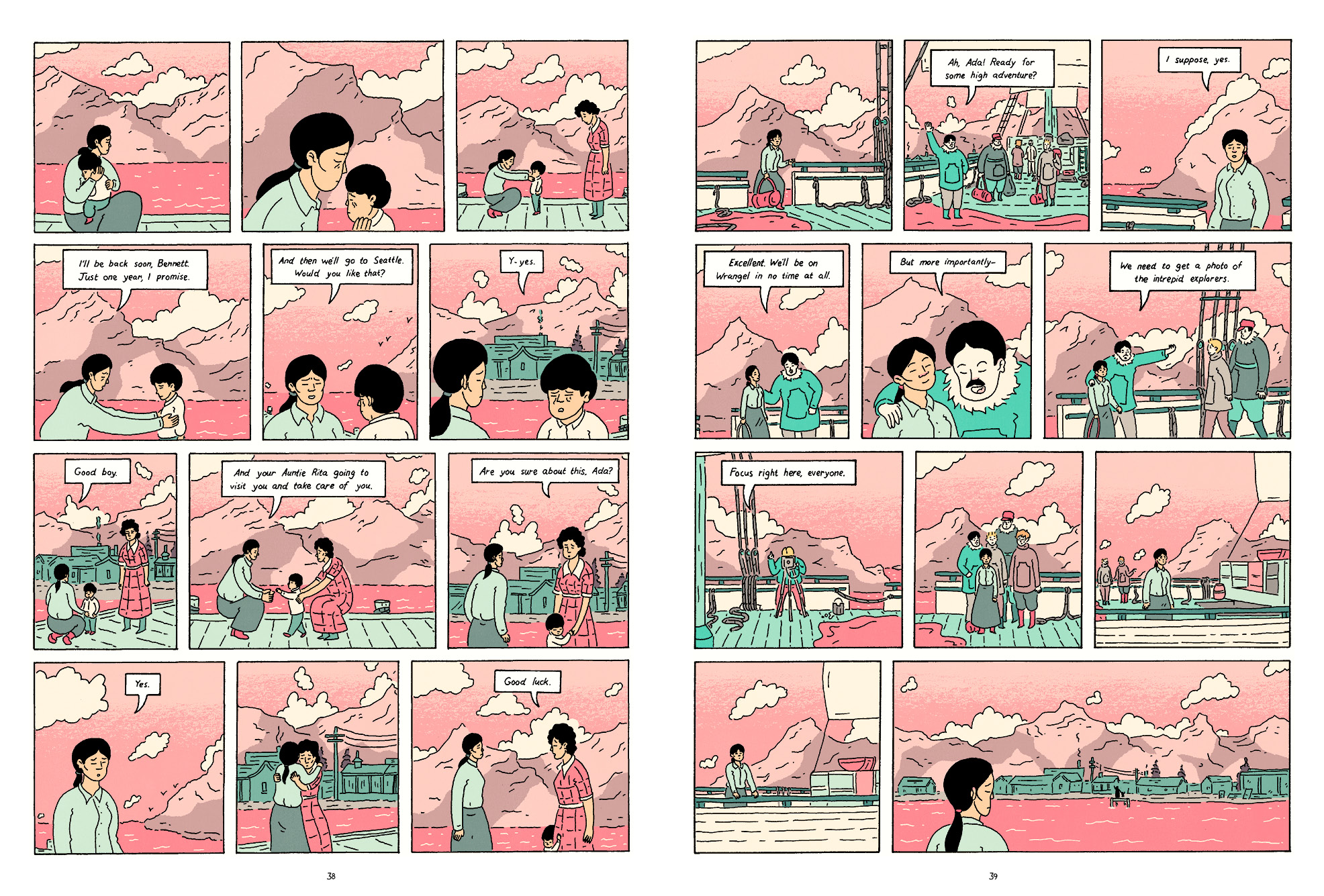
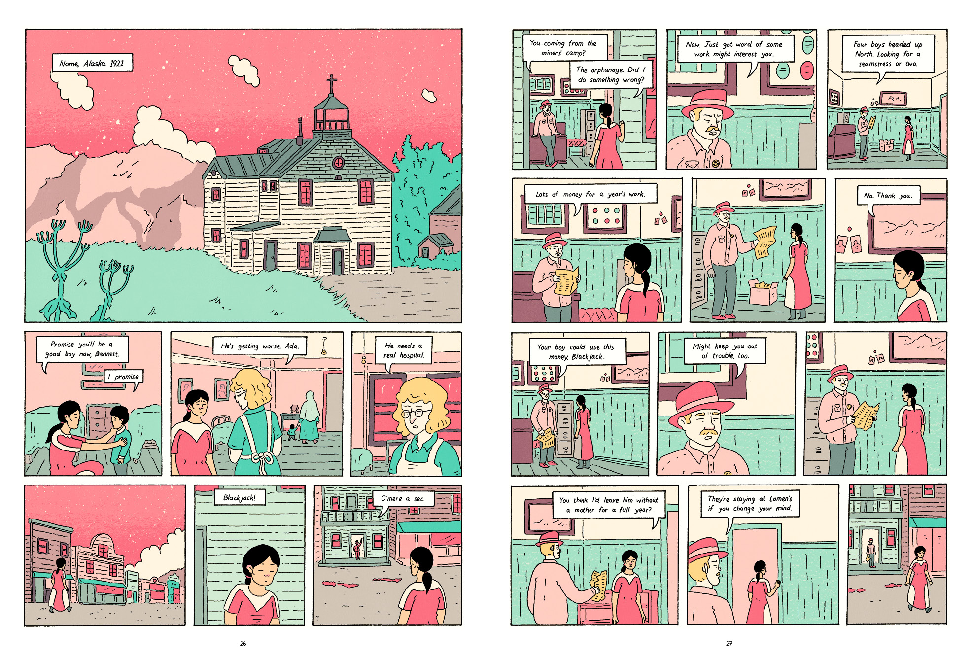
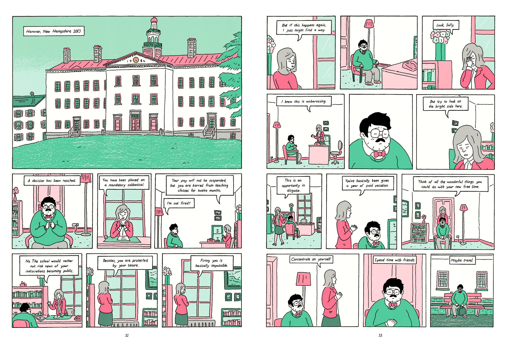
Functionally, each thread of the comic gets its own slice of the color palette; this way, each feels distinct. In fact, the coloring is the major indicator of which timeline you’re currently reading. But the fact that they’re all pulling from the same overarching palette helps them to feel unified as well.
On a more aesthetic level, I knew that I wanted to color this work with a bright, vivid palette. I had so many people suggest I use sepia tones or icy blues, which to me seems just boring and obvious. Having a bright pink night sky is more memorable, I think. And although the book is about fairly bleak events, that’s not really how I wanted to frame the story. Works that wallow, that want you to feel the “darkness” of their stories, can be pretty tedious, I think. FL

