Over the last twenty years of the twentieth century, British graphic designer Vaughan Oliver and his studio 23 Envelope created a distinctive look as important as the music found inside the LP sleeves. Mostly closely associated with the UK label 4AD, Oliver crafted innovative work well into the 2010s, among his most recent being Beneath the Eyrie, the latest Pixies album. Oliver passed away at the age of sixty-two a little over a week ago, on December 29, 2019.
“There was no manifesto to it, but the idea behind the whole 4AD thing was to create something with a logo on it,” Oliver told Interview in 2015 of his work with the label. “‘Oh, it’s the Cocteau Twins with the 4AD thing on the back? What’s this fucking Bulgarian Voices? What’s this fucking Wolfgang Press? I guess I’ll give it a shot.’ I was only twenty years old. I was always a bit wary of putting an identity on the label itself, but I wanted individual identities for the bands that were consistent. Then, with time, you would see a thread start to appear. There was a unity, but without a corporate branding stamp on it.”
Compiling a list of Oliver’s best is both subjective and something of a fool’s errand, but that goes directly to the heart and meaning behind his timeless work: the personal connection between music and the listener, made tangible through a visual medium.
“That was the idea. This was kind of branding before branding—and I generally don’t use the word branding—but it was creating a vibe that made you trust in something,” Oliver emphasized to Interview. “It was amazing because we were doing the Mystery of the Bulgarian Voices records, a Colourbox album, a Pixies album—it was actually quite broad, but somehow it all made sense on the label.”
Here are ten of our favorites, in no particular order.
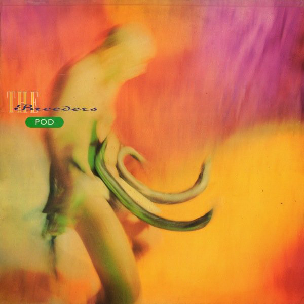
1. The Breeders, Pod (1990)
Among Oliver’s most recognizable and famous images, the cover of The Breeders’ debut also has a pretty great story behind it: Oliver was crushing on band member Kim Deal pretty hard, and in an effort to woo her, he strapped a belt of eels to his waist and performed a “fertility dance” while photographer Kevin Westenberg captured the moment using long exposures.
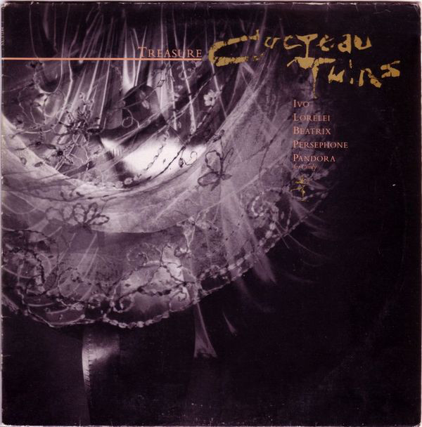
2. Cocteau Twins, Treasure (1984)
The Cocteau Twins’ third album is considered the band’s magnum opus, and Oliver’s gossamer cover image was an ideal match for the dreamy and lyrically indecipherable songs found on the appropriately titled Treasure.
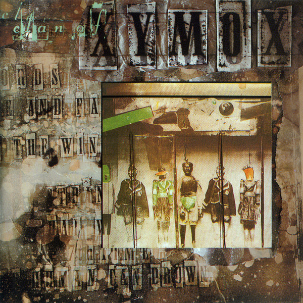
3. Clan of Xymox, Clan of Xymox (1985)
Oliver took a different approach for the debut full-length from these underground goth legends Clan of Xymox. “I was excited by the idea of taking the track listing and working it as illustration: information as illustration,” is how he put it to Time Out in 2013. The weathered imagery complemented such dance-floor classics as “Stranger” and “A Day.”
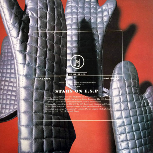
4. His Name Is Alive, Stars on E.S.P. (1996)
Oliver was inspired to create this cover after talking to His Name is Alive’s Warren Defever about his home state of Michigan. Chatting about the state’s mitten-like shape inspired the artist to pull out a pair of oven mitts, serving as an homage to the way Michigan natives use their hand as a map of the state.

5. M|A|R|R|S, “Pump Up the Volume” (1987)
While the planned collaboration between the bands Colourbox and A.R. Kane didn’t exactly come to successful fruition, it did result in this moment of musical alchemy. The manic sample mashup was a surprise hit, and Oliver’s cut-and-paste approach for the 12-inch single cover aligned perfectly with the beat.
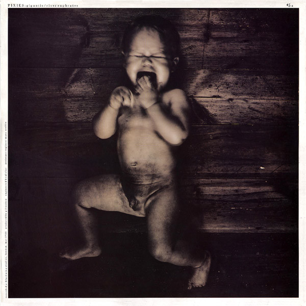
6. Pixies, “Gigantic” (1988)
The Pixies re-recorded this Kim Deal–fronted classic from the band’s debut, Surfer Rosa, for the 12-inch single release. A screaming naked baby on a grainy table is as unsettling and ambiguous as the song itself.
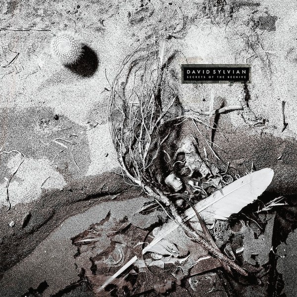
7. David Sylvian, Secrets of the Beehive (1987)
The Japan-legend-turned-ambient-icon David Sylvian was in peak quiet mode on this mid-’80s classic. Oliver went organic for the cover art, realigning nature with subtle detailing.
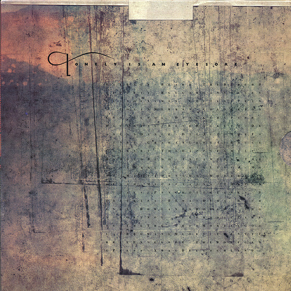
8. Various Artists, Lonely Is an Eyesore (1987)
Diehard fans of 4AD hold a special place in their hearts for this label compilation. An extremely limited set packaged the vinyl, CD, and cassette versions along with a companion VHS tape, etchings, and a screen print in a wooden box. According to Oliver, most of them went to the acts included on the comp. The scratched-up cover image was a picture of the baseboard of the studio camera. “A picture of nothing, basically,” is how the artist aptly described it.
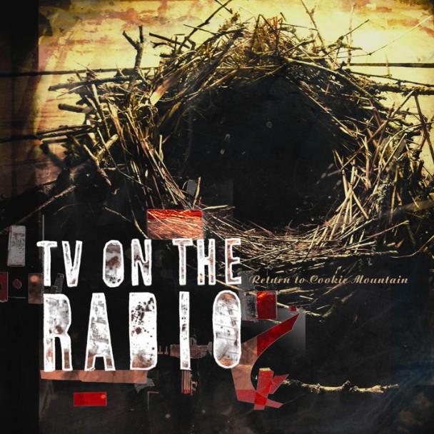
9. TV on the Radio, Return to Cookie Mountain (2006)
These Brooklyn art-rock revivalists went straight to the source for the cover of the band’s second album. A foreboding tunnel into another world with eerie vocal melodies and David Sitek producing? Let’s go!
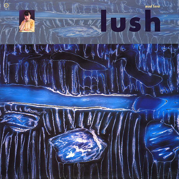
10. Lush, Mad Love EP (1990)
Lush’s initial run of shimmering shoegaze singles were graced with particularly colorful shapes from Oliver. This 1990 EP added subtle layers and the design shock of a graphic image in the corner.

