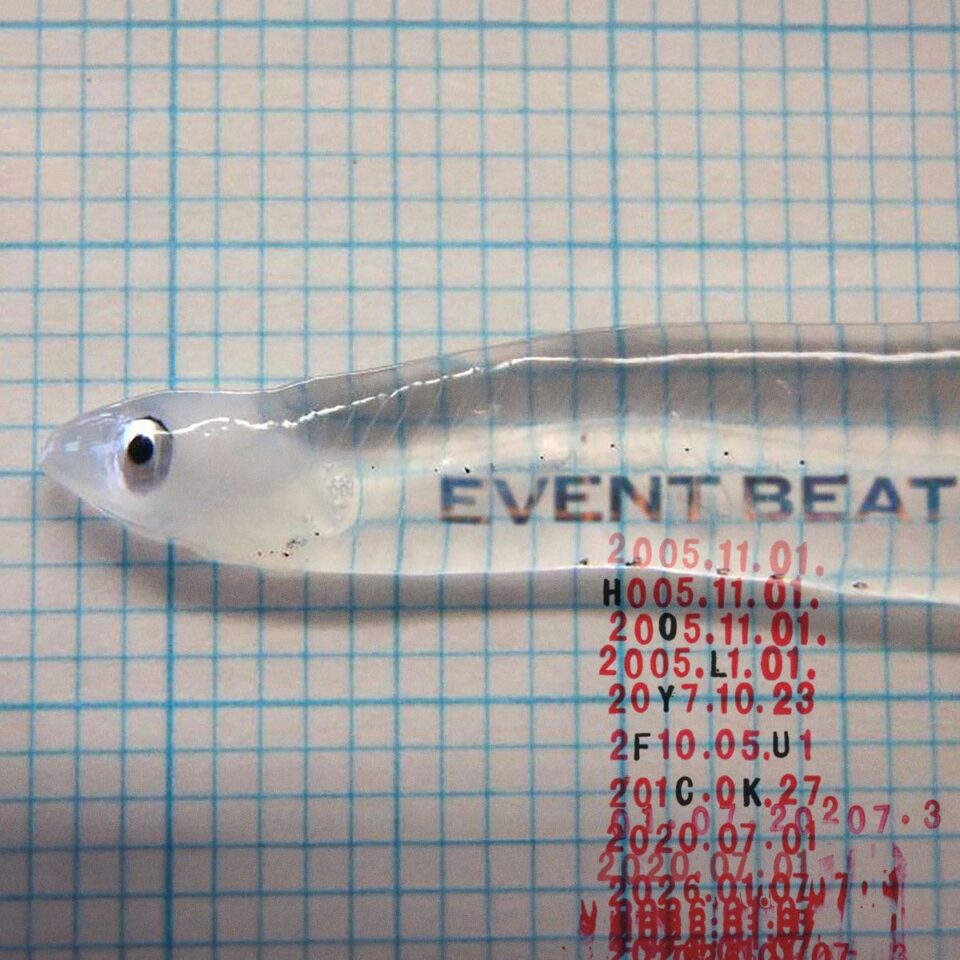
With a cinematic resume that includes icons of anime such as Promare, Kill la Kill, and the anthology series Star Wars: Visions, as well as work on the Stan Lee–penned anime series Heroman, Shigeto Koyama is a god of Japanese animation, an art world superstar whose cartoon signature rivals that of Jeff Koons or the late Keith Haring in its octopus-like tentacles in various design forms including furniture, sneakers, and album covers. With this, Koyama’s work, is its own singular universe far beyond mere animation.
Yet it’s only now at age 47 that Koyama is capitalizing on the fame of having designed the iconic Baymax from Disney’s 2014 film Big Hero 6 by making his wide debut in America with his November trek to New York for the “Shigeto Koyama CCMS Experiment Obake” through Sony Music Entertainment Japan and the launch of its “Art x Entertainment” project. The display at NowHere welcomes Koyama the opportunity to show off two sides of his creative life: the anime design work for which he’s renowned and the other, more personal and experimental CCMS project he’s been involved in for the last 10 years. Beyond the exhibit, however, you can also expect to see Koyama’s Obake-chan—his lean-lined ghost girl mascot plastered across everything owned by every skateboarder, gamer, and tech-nerd you know.
Koyama sat down with us (and several translators) for a rare interview while in New York.

What do you believe are your signatures, the single through lines that set you apart in terms of line and tone?
When it comes to working as an animation character designer, what’s most important to me is the wishes of the director. But when it comes to what I’m working on personally, color is probably the most important element of what I do. The colors of Japan are not a global standard. For most, when it comes to animation, color is an afterthought. But I want to show the world what Japanese color is truly like. I want it to be a global standard.
When and how did the dynamic of color speak to you in the first place?
Color is part of my everyday life. Color has always been in me. Even as I approach other designs beyond animation—toys, fashion, comics, a plethora of different things—color is first. Even stop signs and red lights are purely visual to me.

What was the initial attraction to Sony’s “Art × Entertainment” project?
For me, it’s all about who I work with. It just happened to be that the producer from Sony Music Japan is a good friend of mine. On top of that, there was an opportunity to show off my more underground art. That’s not something I get a chance to do in Japan, because it’s not mainstream. Doing this project, I’m able to have a greater space and more public eyesight into what I do within the underground. That was very appealing to me. It’s like a street musician playing at the metro and selling CDs. By working with Sony, and their “Art X Entertainment” project, I can take the underground overground.
In the initial press for this American debut, you said “This is not an exhibition, this is an experiment.” Can you elaborate on that?
Right now, in Japan, there’s a big boom for solo artist exhibitions. With my gallery show—because I work with Sony, with Estella toy company and Russ & Daughters, with rug manufacturers, with so many other people—I can celebrate their work as well, the many people who make up my gallery show, and not just being solo. This isn’t just me. And that’s an “experiment” for me.
“For most, when it comes to animation, color is an afterthought. But I want to show the world what Japanese color is truly like. I want it to be a global standard.”
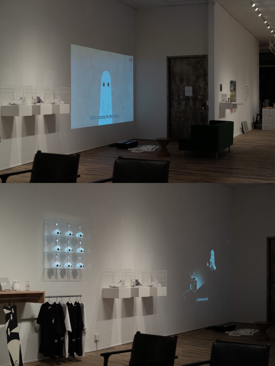
Why does Obake-chan inhabit the soul of the CCMS exhibit as its mascot?
CCMS started off as a zine circle that did fan art. But we always wanted to make our own original character. When it came to creating Obake-chan, CCMS really loved Playmobil. They have a toy, model number 3317, which is a ghost. So they took that and other things they like—the female characters from Evangelion, for example—and mixed them together for Obake-chan.
What is the primary difference—physically, emotionally, and spiritually—between what you do as part of CCMS and what you do as GEEKBOAT, another comic concern of yours?
CCMS is all about design. GEEKBOAT is all about animation. The themes and jokes are often the same. The only difference is how we categorize them. Both groups are very trusting of me, and playful at the same time.
What is the greatest difference between working on Japanese anime projects and with a behemoth such as Disney?
None. It’s just that Disney’s contracts are very scary to me.

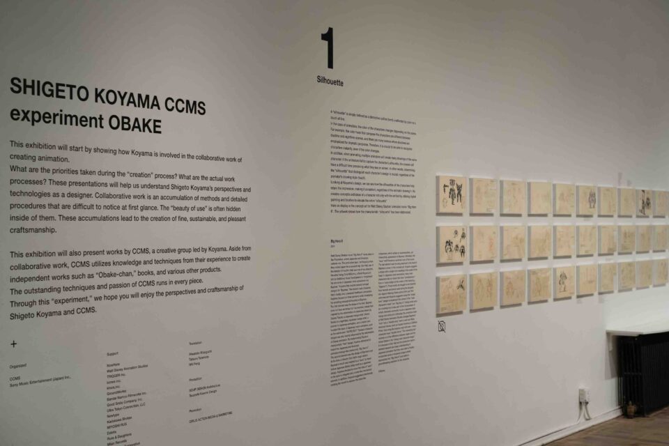
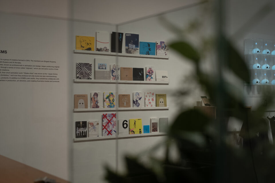
One of the items you made your own and will have on display at your exhibit is your new Converse high tops that serve as a tribute to the Ramones. Why do the Ramones represent the essence of America, NYC, and punk rock for you?
One of the most iconic aspects of a Converse [shoe] is the black and white—as it is with the Ramones. Same for me with Obake-chan. I’ve also always loved the Ramones, the simplicity of it all. The three-chord guitar. The fact that it’s only four people rather than a whole big orchestra. In my Heroman, the character wears a leather jacket which is another tribute to the Ramones. In Promare, my Leo character also wears a leather jacket. The Ramones also sing about 53rd and 3rd—an intersection that’s iconic for New York. I’ve been obsessed with that intersection since I was young. I have a custom license plate back home that reads “53 0 3.”
Considering all of your different work, alone or in collaboration, do you compartmentalize? Or is there significant bleed?
In Japanese culture, we’re invited in to do the work. I’m always here for the invitation. When it comes to the different works, I don’t really compartmentalize. It all comes down to the projects. The bleed is the bleed is the bleed—things may be different, but there’s always a Koyama approach. And I’m always working on 10 projects at once, but there are only seven days a week. Before, seven projects would get done in seven days, and three would get left behind. Now, I just do them all at once. FL
