
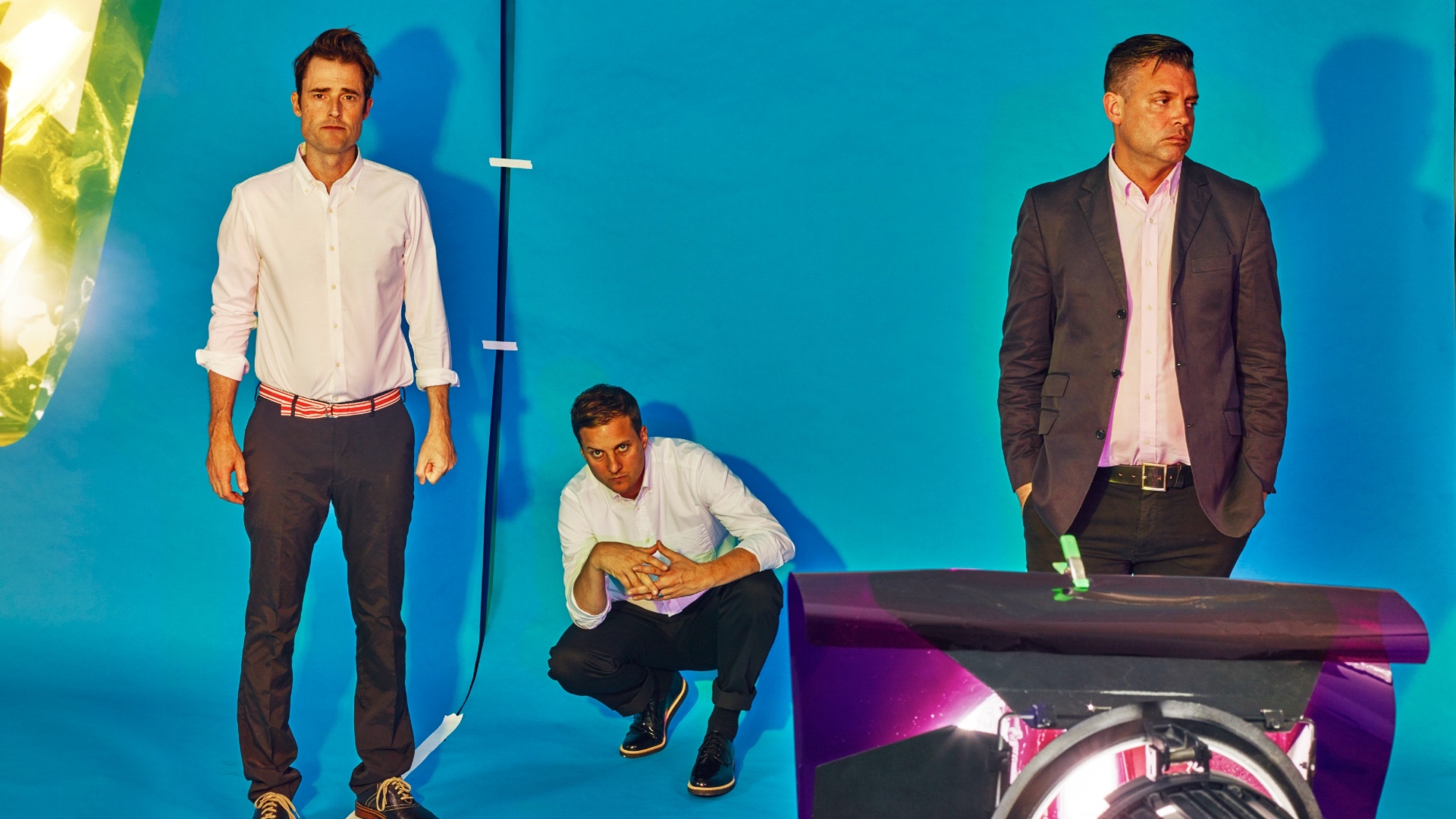

There comes a point in every band’s career when its members are faced with the decision to take the leap: to quit their day jobs and really go for it. That day is far behind the New York trio Battles, who have been crafting their unique brand of wildly imaginative art rock for over a decade. But for bassist/guitarist Dave Konopka—a designer by trade who doubles as the band’s de facto art director—in some ways, that day never really came.
The former chief designer at a New York publishing house, Konopka has created the artwork for Battles since day one—artwork that fans of the band know to be every bit as distinctive, evocative, and fun as the music itself. “There’s this really nice synthesis that happens where they feed each other,” says Konopka of his two mediums. “It’s a one-hand-washes-the-other type of situation, where you feel inspired in both realms.”
From the reflective cube of their debut album Mirrored and the iconic pink blob of 2011’s Gloss Drop to the culinary orgy of their newest album La Di Da Di, Battles’ artwork has become something of an institution. We spoke to Konopka about the art he’s made for Battles over the years, what inspires it, and how he wound up putting “a watermelon getting boned by a banana” on the cover of their newest album.
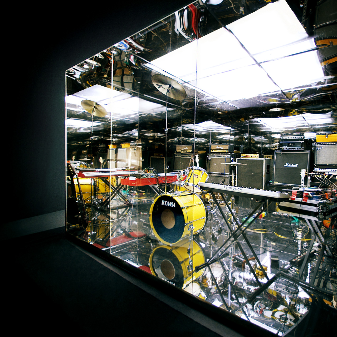
Mirrored (2007)
I wanted to build this mirrored room, and both my brothers are carpenters, so they helped me. I asked our friend Tim Saccenti to shoot it, and he was like, “Yeah, we should shoot a video in it too.” We were really excited to sign to Warp, and I think we were kind of playing that game a little bit more, where it’s like, “This is going to be slicker, this is going to be cool.”
[It] was totally inspired by Fripp & Eno album cover for (No Pussyfooting). But it made sense for us because other than the EPs, it was our introduction to the world; it was important to put all of the tools that we used to make our music as a representation of who we are inside of this room. The concept of the repetition we use in our music was mimicked by the reflective infinite room.
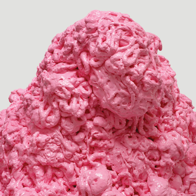
Gloss Drop (2011)
[Mirrored’s artwork] was so conceptually heavy that my concept for Gloss Drop was just like, “I just want to have this big pink piece of shit on the cover. When anybody sees a big pink piece of shit, they’ll think of Battles.” I made that sculpture before the album. We kind of knew going in that it was going to be nonrepresentational, so the music could be anything.
I hate the color; it was like, “I just want to do this gross thing.” And it actually ended up looking beautiful, because my friend Lesley [Unruh] who shot that—and who shot the La Di Da Di album cover—is such an amazing photographer. I was really happy that she made that look so much better than what it really was.

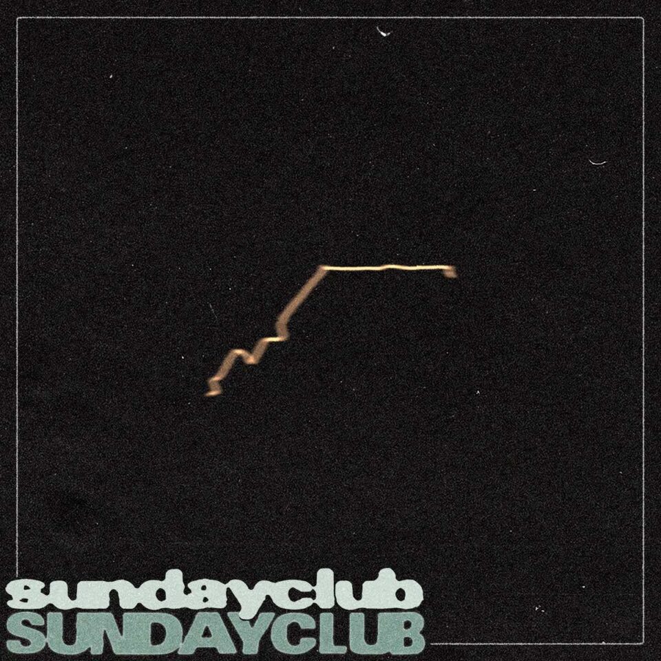
La Di Da Di (2015)
I wanted this absurdist effect—a humorist approach—to convey the process of how we actually arrive at making an album, or who we are as three individuals and how we relate to one another. It’s indicative of our writing process, which I’ve never really touched upon in any of the artwork. I think it’s interesting what you get when you combine things, to the point where you keep combining and combining and combining until you get this uniformity.
I was kind of freaking out for the two years that we were making the album, because I didn’t understand how it was coming together—none of us did. It was just like this weird thing, like, “We have all these ingredients that we’re working with, but we don’t know what it’s going to look like or what it’s going to sound like.” I realized at some point that my anxiety about making the art and coming up with something new and refreshing was being mirrored by the whole process of making the album as well. It was this really bizarre, meta-type process for me.
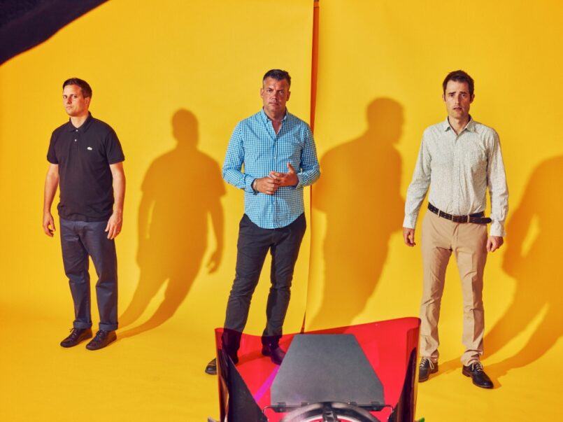
Battles / photo by Grant Cornett
It wasn’t really an epiphany, but I was like, “Wait, I need to convey this message somehow, and it has to be something that’s relatable to people.” It was kind of masking this weird anxiety with absurdity and humor, having food and stuff. Because if it’s just paint, it would be like, “Oh, look! Somebody got artsy!” You know, “Red and green, and it made brown, and wow!”
When I was making those food installations, and Lesley was shooting them, she was like, “You’re fucked up,” [Laughs.] The imagery that I used for “FF Bada” is like this chicken getting plowed by an Italian hoagie on top a stack of pizza, and she was like, “This is going to be really provocative. You’re going to have to answer to, like, PETA or something.” Even though it was humorous, it all made sense to me in my head, in this really bizarre way.
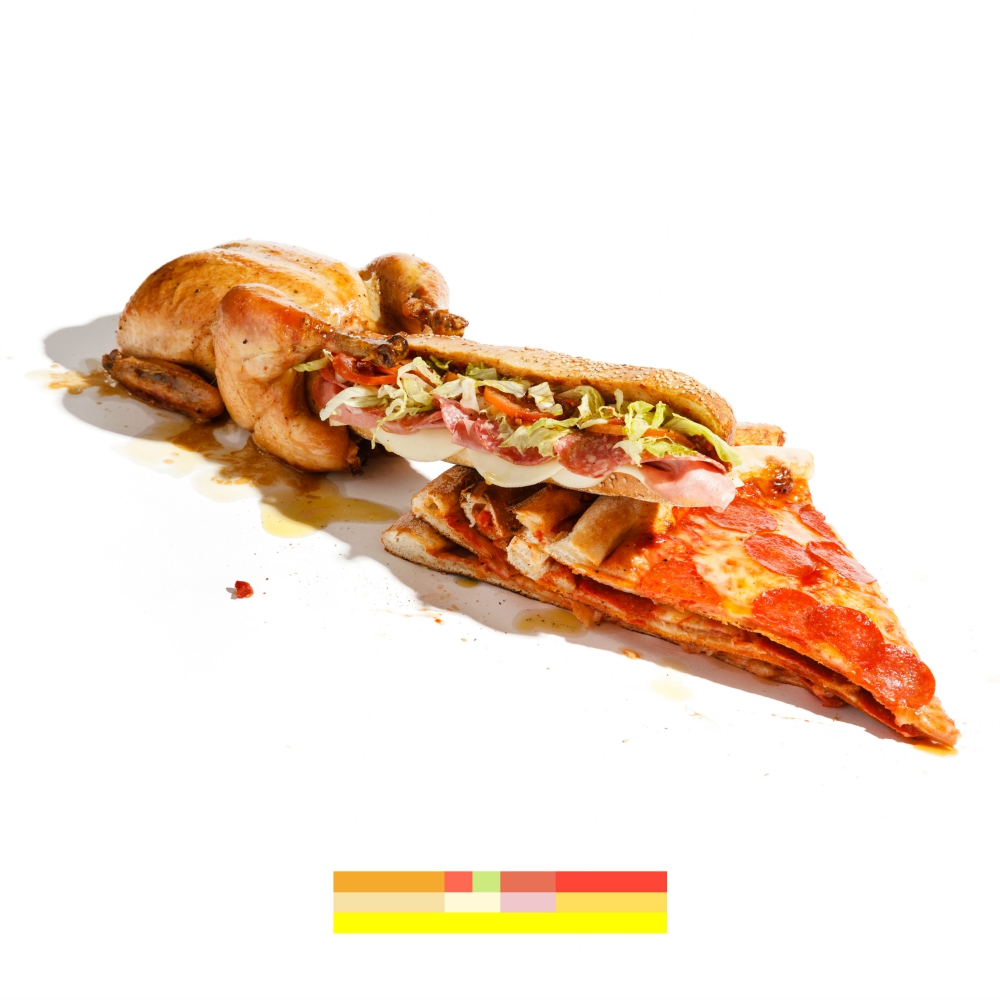
I liked the idea of incorporating this color bar that was this abstract representation. I described it to [bandmates] John and Ian as a visual subtitle that’s conveying what’s happening in the imagery and just breaking it down into these really simple parts, which is kind of how our album came together. It was following through with these alternative forms of communication and how these ideas get conveyed without speaking. It’s a visual translator. FL
